The Influence of Color Psychology on Your Phone’s Wallpaper: Exploring the Impact of Colors on Your Mood and Productivity
Color psychology has been studied for decades and has been found to have a significant impact on human emotions and behavior.
The use of color is not only limited to interior design and fashion, but it also extends to digital media, including phone wallpapers.
The colors used in phone wallpapers can have a profound effect on the user’s mood and overall experience.
Understanding color psychology is essential in creating a positive user experience.
Different colors have different meanings and can evoke different emotions.
For example, blue is associated with calmness and serenity, while red is associated with passion and excitement.
By understanding the psychological effects of different colors, designers can create wallpapers that align with the user’s mood and preferences.
Color psychology in design has been extensively researched, and case studies have shown that the use of specific colors can have a significant impact on user behavior.
For example, a study found that using blue and green colors in a website design increased user engagement and trust.
Similarly, another study found that using warm colors like red and orange in a call-to-action button increased conversion rates.
Key Takeaways
- Understanding color psychology is essential in creating a positive user experience.
- Different colors have different meanings and can evoke different emotions.
- The use of specific colors can have a significant impact on user behavior.
Understanding Color Psychology
Color psychology is the study of how colors affect human behavior, emotions, and mood.
The colors we see can impact our feelings, thoughts, and actions in ways that we may not even realize.
Understanding color psychology is important when it comes to choosing a wallpaper for your phone.
Basics of Color Theory
Color theory is the study of how colors interact with each other.
It includes the primary colors (red, blue, and yellow), secondary colors (green, purple, and orange), and tertiary colors (yellow-green, blue-green, blue-purple, etc.).
Emotional Responses to Colors
Colors can evoke different emotional responses in people.
For example, red is often associated with passion, love, and anger. Blue is commonly associated with calmness and relaxation. Yellow is often associated with happiness and positivity.
Cultural Interpretations of Color
Colors can also have different meanings across different cultures.
For example, in Western cultures, white is often associated with purity and innocence, while in some Eastern cultures, white is associated with death and mourning.
When choosing a wallpaper for your phone, it’s important to consider the emotional and cultural associations that different colors may have.
By choosing a wallpaper that reflects your mood and personality, you can create a more positive and enjoyable experience when using your phone.
Color Psychology in Design
When it comes to design, color plays a crucial role in creating a visually appealing and effective product.
The colors used in design can evoke different emotions and feelings in the user, making them feel a certain way about the product. This is where color psychology comes in.
Influence on Perception
Color psychology is the study of how colors affect human behavior and emotions.
Different colors can evoke different emotions and feelings in people.
For example, blue is often associated with calmness and tranquility, while red is associated with excitement and passion.
By understanding the psychology of colors, designers can use them to their advantage to create a specific mood or feeling for their product.
The use of color in design can also influence the user’s perception of the product.
For example, a product with a blue color scheme may be perceived as more professional and trustworthy, while a product with a red color scheme may be perceived as more exciting and energetic.
This is why it’s important for designers to carefully consider the colors they use in their designs.
Color Trends in Tech
In the tech industry, color trends are constantly changing.
For example, in recent years, there has been a trend towards using more muted and neutral colors in tech product designs.
This is because these colors are often associated with professionalism and sophistication.
However, there are also tech products that use bright, bold colors to stand out and make a statement.
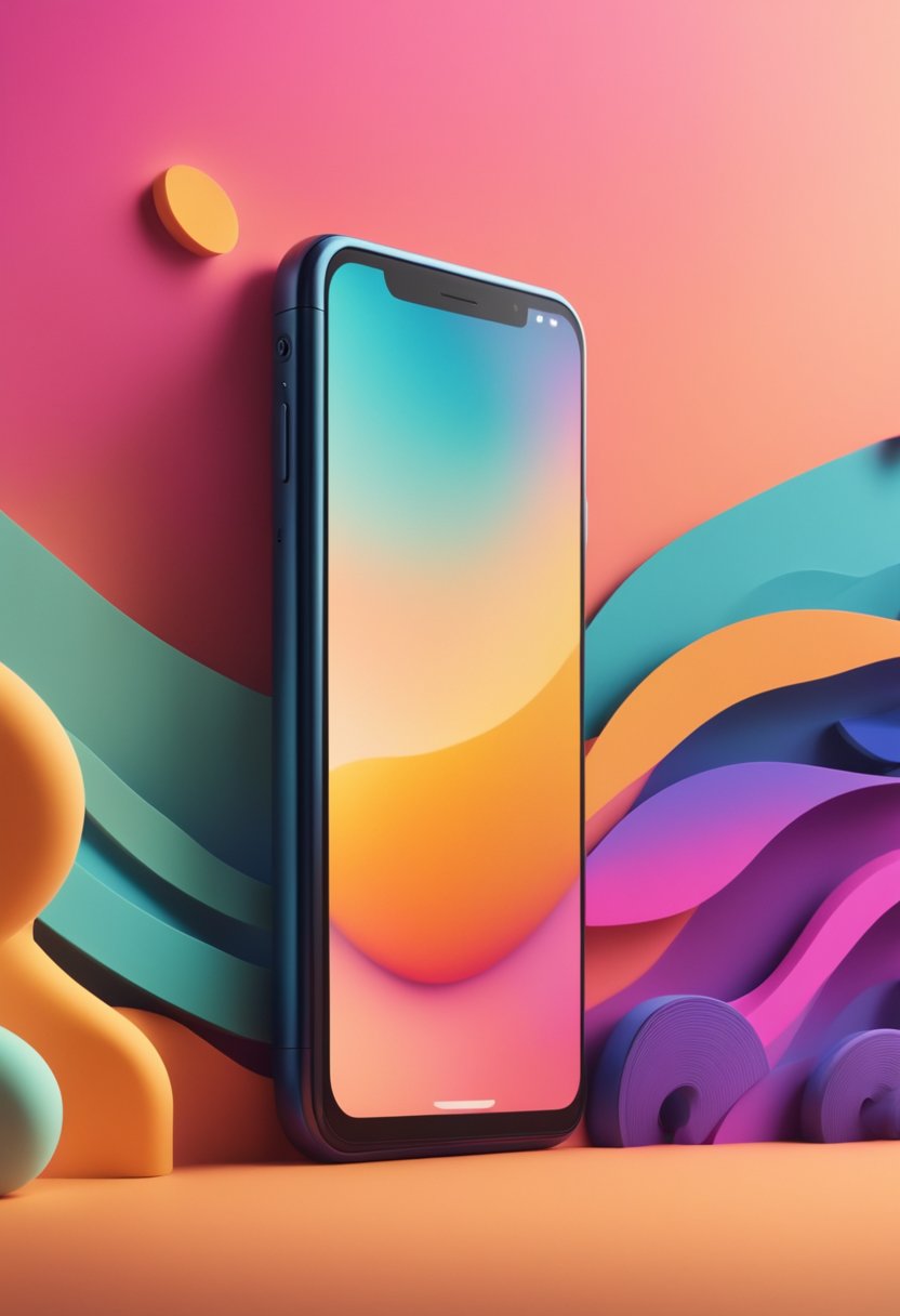
For example, the iPhone XR comes in a range of bright colors, including yellow and coral. These colors are meant to appeal to a younger, more fun-loving audience.
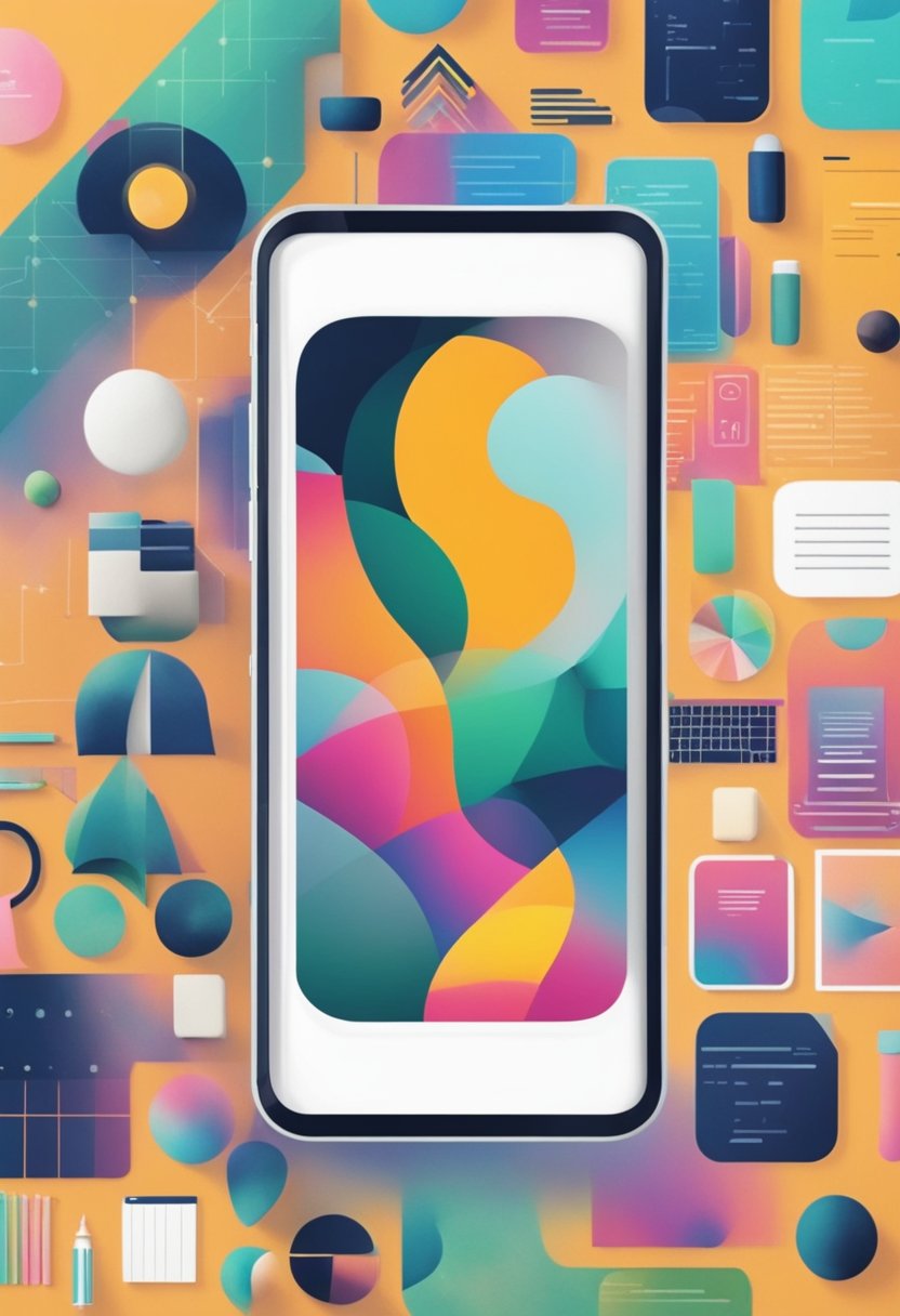
Choosing Your Wallpaper
When it comes to choosing a wallpaper for your phone, there are a few things to consider.
Personalizing your device is a great way to make it feel more like your own, and choosing a wallpaper can be a fun way to express your personality.
Personalizing Your Device
There are many ways to personalize your phone’s wallpaper.
You can choose a photo of a loved one, a favorite place, or a pet. You can also choose a pattern or design that you love.
Some people prefer to use their favorite color as their wallpaper, while others prefer a more neutral background.
Mood Enhancement Strategies
The colors you choose for your wallpaper can have a significant impact on your mood.
Different colors can elicit different emotions, so it’s essential to choose a color that matches the mood you want to create.
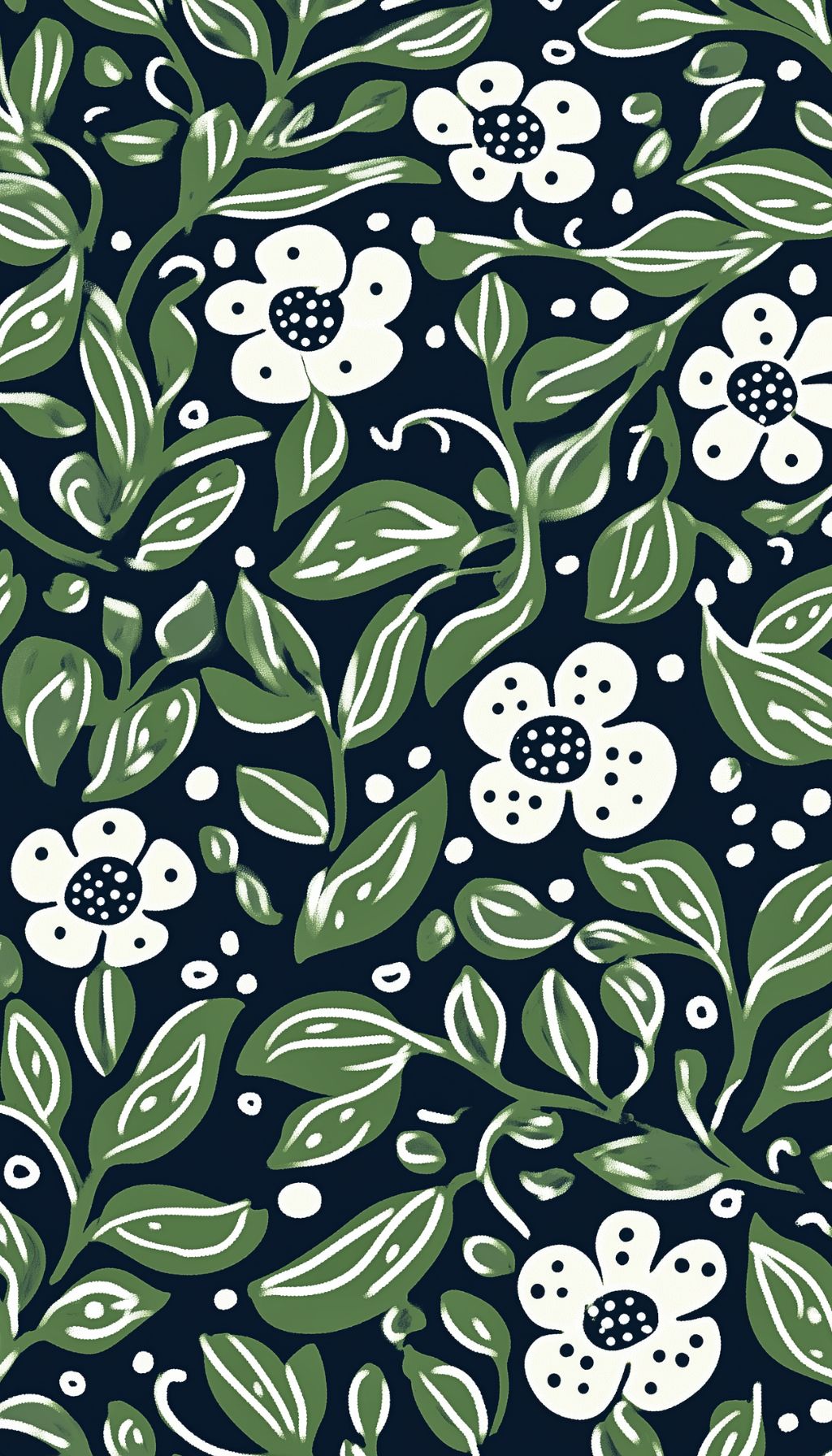
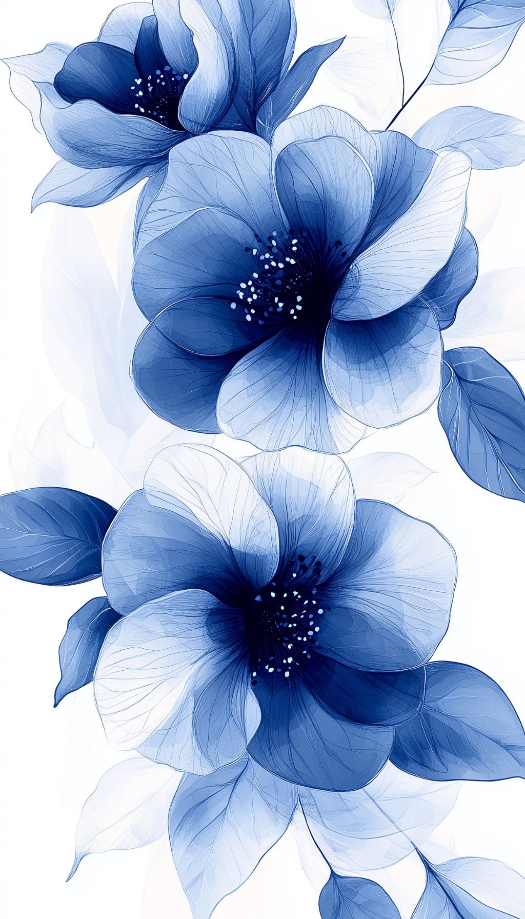
For example, if you want to create a calm and relaxing atmosphere, you might choose a wallpaper with shades of blue or green.
These colors are known for their calming effects and can help reduce stress levels.
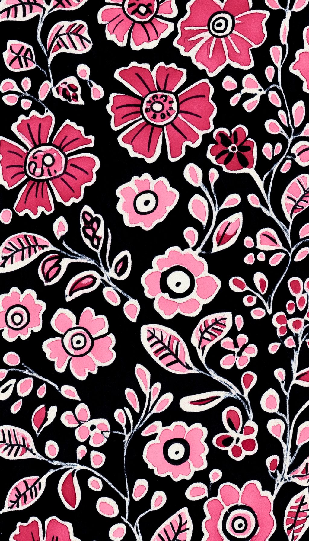
On the other hand, if you want to create a more energizing atmosphere, you might choose a wallpaper with shades of red or orange.
These colors are known for their stimulating effects and can help boost energy levels.
It’s important to note that everyone reacts differently to colors, so it’s essential to choose a color that resonates with you personally.
Impact on User Experience
Daily Interaction with Color
The colors used in a phone’s wallpaper can have a significant impact on the user’s daily experience.
Bright and vibrant colors can create a sense of excitement and positivity, while dull and muted colors can create a feeling of sadness or boredom.
Users often spend a lot of time interacting with their phone’s wallpaper, whether it’s to check the time, view notifications, or simply admire the design.
Therefore, it’s important to choose colors that will have a positive impact on their mood and overall experience.
Accessibility Considerations
When choosing colors for a phone’s wallpaper, it’s important to consider accessibility.
Some users may have color blindness or other visual impairments that make it difficult to distinguish between certain colors.
Designers should ensure that the colors used in the wallpaper are accessible to all users, regardless of their visual abilities.
This can be achieved by using distinct shapes or patterns in addition to color, or by using high contrast colors that are easier to distinguish.
Psychological Effects of Color Choices
The colors you choose for your phone’s wallpaper can have a significant impact on your mood and behavior. Here are a few of the psychological effects of color choices:
Stress Reduction
Certain colors are known to have a calming effect on the mind and body, making them ideal for reducing stress and anxiety.
Blue, for example, is often associated with feelings of calmness and tranquility. Green is another color that can help to reduce stress, as it is associated with nature and the outdoors.
Using these colors in your phone’s wallpaper can help you feel more relaxed and less anxious throughout the day.
Productivity and Focus
If you need to stay focused and productive throughout the day, certain colors can help.
Yellow, for example, is often associated with energy and optimism, making it a great choice for those who need a little extra motivation.
Red is another color that can help to boost productivity, as it is associated with excitement and intensity.
Using these colors in your phone’s wallpaper can help you stay focused and motivated throughout the day.
Research and Case Studies
Consumer Behavior Studies
Numerous studies have shown that colors have a significant impact on consumer behavior.
For instance, a study conducted by the University of Loyola, Maryland, found that color increases brand recognition by up to 80%.
In another study, researchers found that color can influence a customer’s perception of a product’s quality and value. For example, black and gold are often associated with luxury and high-end products.
Additionally, color can also influence a customer’s purchasing decisions.
A study by the Seoul International Color Expo found that 92.6% of consumers surveyed said that they put the most importance on visual factors when purchasing a product. This includes color, design, and overall visual appeal.
Color Preferences in Age Groups
Research has also shown that color preferences vary among different age groups.
For example, a study conducted by the University of Texas found that younger people prefer brighter, more vibrant colors, while older people prefer more muted, calming colors.
This is likely due to the fact that younger people tend to be more energetic and adventurous, while older people tend to be more relaxed and calm.
Another study found that men and women also have different color preferences.
Women tend to prefer softer, more feminine colors such as pink and lavender, while men tend to prefer bolder, more masculine colors such as black and red.
These studies suggest that color psychology plays a significant role in consumer behavior and can have a significant impact on purchasing decisions.
By understanding the color preferences of different age groups and genders, businesses can create more effective marketing campaigns and product designs that appeal to their target audience.